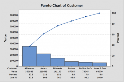
They say that a picture paints a thousand words, consider the columns of data below which show revenue by product and customer for the last 3 months. How easy is it to see which customer gives the most revenue?

Now consider the graph (A Pareto chart) below, and once again ask how easy is it to see which customer gives the most revenue.

The vast majority of people will answer that it is much easier to see from the graph which customer gives most revenue!
The power of graphical relationships to convey meaningful information quickly should not be underestimated, particularly where busy stakeholders are concerned! Graphical Analysis is often the first attempt at understanding a problem using data. These techniques will help reveal relationships, trends and patterns within the data, and are quite often at the heart of communication strategies with Customers, Champions, PO’s and other Stakeholders.
Graphical techniques are some of the simplest but most powerful tools available. They will also be useful to identify theories, or hypotheses, that can be tested subsequently with statistical methods.
The table below shows typical graphs and their applicability. The techniques range from a simple time series plot which shows trends of data (X or Y) over time to a more complex multi-vary chart which allows complex relationships between a number of X’s and one Y, for example how does sales vary by customer, product type and sales person.
|
Graph name/ type |
Minitab Menu |
Usage |
|
Time Series Plot |
Graph>Time Series Plot |
Looking for changes over time (x or Y) |
|
Pareto Chart |
Stat>Quality tools>Pareto |
Looking at the contribution between different categories |
|
Box Plot |
Graph>Box Plot |
Looking at groups of distributions, categorical x’s continuous Y. |
|
Frequency distributions • Histograms • Dot plots |
Graph>Histogram Graph>Dot plot |
Understanding shape and distribution of data (normal, bimodal etc). Continuous data |
|
Scatter Diagram |
Graph>Plot |
Looking at the relationships between variables (x & Y) |
|
Multi-Vari Chart |
Stat>Quality tools>Multi-vari chart |
Looking at complex relationships of many x’s and a Y |
Understanding what these charts are and how to use them is a basic need for any self-respecting improvement project leader!