Lean Six Sigma is a data driven decision making approach. Most people are confident in mapping a process, the next question then is what data could I collect, and how should I decide which data is most important? One of the biggest mistakes that new process improvement leaders make is to try and collect too much data!
This article will illustrate a four step process to decide what data to collect and describe some simple tools to aid that process.
Why do we need data?
In lean Six Sigma projects we are trying to do one of two things: identify and eliminate waste, or identify and reduce variation. Both need data. For waste elimination, often once we have carried out process mapping we have data available to us of the waste in the process and may not need further data (or we may have a top level view and need further data to support our investigation, for example the value stream map shows that non value added is 95% of the time in the process, and we need to find out where precisely this time is being lost).
For variability reduction, it is often not clear what data we need and we will need to think about what data is required. In essence this is the start of the investigative process of finding the root cause of our variability. The equation Y=f(x) means Y is a function of x, or if preferred outputs are a function of inputs.

The Analyse phase is all about investigating relationships and deciding which factors are most significant in influencing the output, for example which factors in a moulding process are most significant in producing scrap, which factors in the learning process are most significant in ensuring a pass in the exam! The purpose of the Measure phase is firstly to ensure we can quantify our Y, or output, baseline performance, and also to ensure that the data required for our x’s is available for analysis when we get to the Analyse phase!
The reason we do process mapping is to understand the steps that are involved in the process under investigation. Once we know the process steps we have to determine the variables within each step that may be cause of our problem. In most cases there will be many more variables than we can collect data for with the limited resources we have and so there is a need for prioritisation. Typically this has two stages, the first pass to eliminate those factors that are of no interest, and the second stage to reduce the remaining factors to a more manageable number. Having reduced the variables to a manageable number we then can plan the data collection.
The four stages we would recommend are as follows:
- List the process variables
- Eliminate those of no interest
- Prioritise the remaining variables
- Prepare the data collection plan
List the Process Variables
The first step is to brainstorm with the team those potential factors that are considered as possible factors, or causes of the effect being studied.
An example would be which factors in a semi-conductor manufacturing facility may be causing high scrap, the voltage applied, the chemical solution, the silicon purity, or other factors? Or which factors in barbequing a burger may be causing it to be burnt, the burger itself, the cook time, the cooking temperature, the chef and so on.
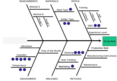
The cause and effect diagram is a good tool to assist the thinking process in the team, giving 6 key areas to consider:
- Manpower
- Material
- Methods
- Machinery
- Measurements
- Mother Nature (environment)
They all start with M which makes it easier to remember what they are. It is not essential to use these 6 categories but they are a widely accepted framework for identifying potential causes. An example is shown below for potential causes for High Scrap Rate

The diagram is drawn on a flip chart or white board, with a horizontal line pointing towards the effect, which is recorded on the right hand side of the diagram. The six effect lines are drawn at 45 degrees to the horizontal line and marked up with the heading above. The potential causes of the effect are then brainstormed by the team, and listed on the diagram as they are identified by the team. It is not crucial that they are listed under the correct heading, so best not to spend too much time debating which headings they go under, use the first one that comes to mind unless everyone agrees it is the wrong category.
For complex processes with a series of steps involved there may be a need to construct several cause and effect diagrams. An example might be investigating the cause of damaged units being discovered at the final stage in a machining, plating and finishing facility, the cause(s) may lie in any of the three stages, and it makes sense to construct three diagrams to cover all areas. It would be too complex to list all potential causes on a single diagram.
Eliminate Variables of No Interest
The biggest mistake students make at this stage (unless they know better!) is to then try and collect data, or even try to fix, all the areas brainstormed onto the cause and effect diagram. The crucial step that prevents this is to eliminate process variable of no interest. The tool that is best suited to this is called pen dot voting.

Pen Dot voting is a quick & efficient way of conducting a ‘first pass’ assessment to prioritise variables & eliminate variables of no interest. It is a qualitative tool as no data is required to carry it out, just process knowledge. Each team member is given a marker pen and asked to place (say) 10 votes on the Cause & Effect diagram. No more than (say) 3 votes are allowed on any one item. Once all team members have voted, tally the votes for a quick, simple way of prioritising the variables. All variables without any votes are of no further interest.
Prioritise remaining Process Variables
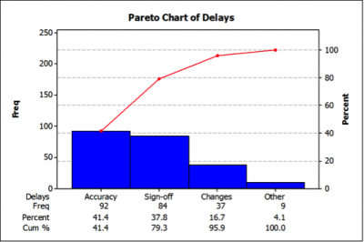
If too many variables remain, then they can be further prioritised using the Pareto approach. We are looking to find the 20% of potential causes that have 80% of the votes made during pen dot voting.
Add up the total number of votes cast (probably 50 if there are 5 people voting) and then count the votes for each item, listing them in quantity order, with the highest quantity first. Draw a bar chart if necessary showing the votes for each item, and plot the cumulative percentage of total votes on the graph with the percentage scale shown on the right hand axis.
Select the 20% of the items that have 80% of the votes, or alternatively the number of items for which resource is available for collection.

Prepare the Data Collection Plan
The data collection plan should identify:
- The practical problem or question to be answered by data collection
- The metric and units of measurement
- Type of Data (Attribute or Continuous)
- How measured (Gauge, Measurement System)
- Related Data to Collect (traceability)
- Sampling Method
- Where collected
- Who is responsible
- How data will be recorded
- When/Frequency of data collection
Here is an example of a pro-forma for a data collection plan.

In summary, data is essential to any lean six Sigma project. Inexperienced practitioners often try and collect too much, or the wrong data. Following the four stages of List the process variables, eliminate those of no interest, prioritise the remaining variables and then prepare the data collection plan will help practitioners ensure they capture the right data.